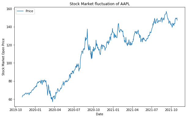
data에 담겨있는 애플의 주가정보 중 ‘Open’에 해당하는 전일 종가를 가장 앞쪽(.head())부터 출력한 것이다. 애플주식이 이렇게 쌌었나 검색해보니 이게 맞다….
방법 1. Pyplot API
1 2 3 4 5 6 7 8 9 10 11 12 13
# import fix_yahoo_finance as yf import yfinance as yf import matplotlib.pyplot as plt
data = yf.download('AAPL', '2019-11-01', '2021-11-01') ts = data['Open'] plt.figure(figsize=(10,6)) plt.plot(ts) plt.legend(labels=['Price'], loc='best') plt.title('Stock Market fluctuation of AAPL') plt.xlabel('Date') plt.ylabel('Stock Market Open Price') plt.show()
Output
[*********************100%***********************] 1 of 1 completed
이처럼 결과가 출력되지만 이 문법은 시각화를 처음배우는 초심자에게는 적합하지 않다고 한다. 후술할 문법과 위 문법 모두 출력은 되나 이 문법은 객체지향이 아니기도 하고 상대적으로 복잡하기때문에 초심자의 경우에 헷갈릴수 있어 사용하지 않는다. 구글링 했을때 객체.이 아닌 plt.으로 시작하는 애들이 있다면 그 코드는 스킵하는게 좋다.
방법 2. 객체지향 API
1 2 3 4 5 6 7 8 9 10 11 12 13 14 15
from matplotlib.backends.backend_agg import FigureCanvasAgg as FigureCanvas from matplotlib.figure import Figure import matplotlib.pyplot as plt
fig = Figure()
import numpy as np np.random.seed(6) x = np.random.randn(20000)
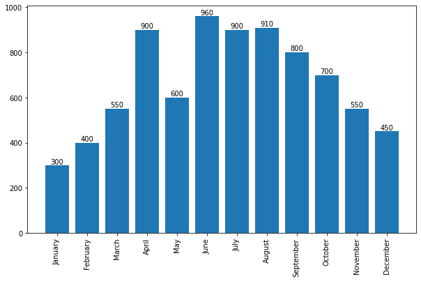
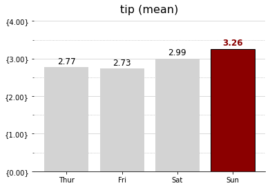
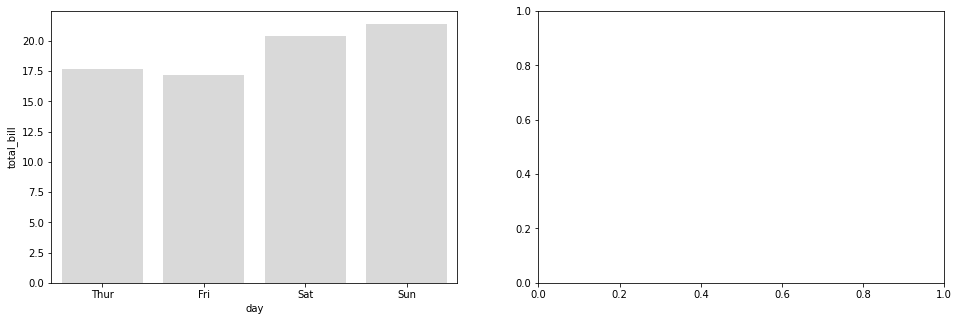
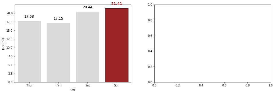
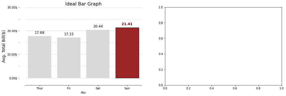
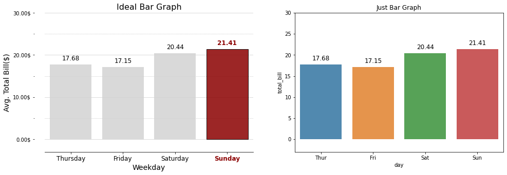
.xticks()는 x축의 눈금을 나타내는 메소드인데 기본적으로는 list자료형 한개을 사용한다. 하지만 메소드에 인자가 ‘list’ 두 개로 받아졌을 경우, 첫번째 list는 x축 눈금의 갯수가 된다. 두번째 list는 x축 눈금의 이름이 된다. 이 코드에서는 rotation 옵션도 들어가 있는데 이것은 그냥 이름을 몇도정도 기울일지 나타낸다.
plot = ax.bar()는 그래프를 막대로 만든다. 첫번째 리스트 인자의 수 만큼 막대가 생성되고, 두번째 리스트 인자의 값 만큼 막대가 길어진다. 이렇다보니 첫번째 리스트와 두번째 리스트의 인자의 수가 일치해야 에러가 나지 않는다.
for문 내부의 ax.text()는 Seaborn-막대그래프-표현할 값이 한 개인 막대 그래프 챕터에 서술했으니 참고하길 바란다.
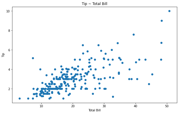
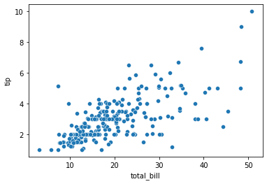
산점도 그래프
두개의 연속형 변수 (키, 몸무게 등)
상관관계 != 인과관계
나타내는 값이 한가지인 산점도 그래프
1 2 3 4 5 6 7 8 9 10 11 12 13 14 15
import matplotlib.pyplot as plt import seaborn as sns
# 내장 데이터 tips = sns.load_dataset("tips") x = tips['total_bill'] y = tips['tip']
fig, ax = plt.subplots(figsize=(10, 6)) ax.scatter(x, y) # 각각의 값을 선으로 표현해주는 scatter() ax.set_xlabel('Total Bill') ax.set_ylabel('Tip') ax.set_title('Tip ~ Total Bill')
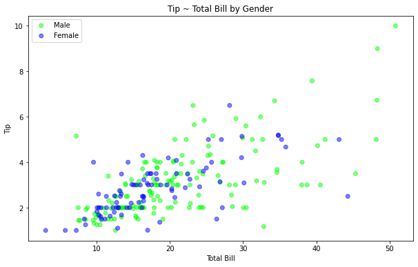
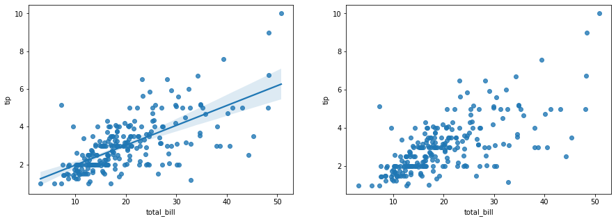
fig, ax = plt.subplots(figsize=(10, 6)) for label, data in tips.groupby('sex'): ax.scatter(data['total_bill'], data['tip'], label=label, color=data['sex_color'], alpha=0.5) ax.set_xlabel('Total Bill') ax.set_ylabel('Tip') ax.set_title('Tip ~ Total Bill by Gender')
ax.legend() fig.show()
Output
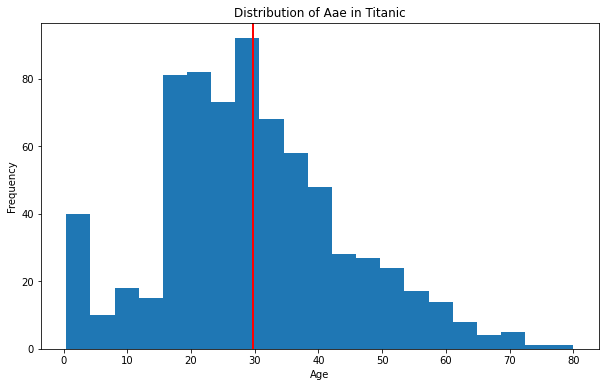
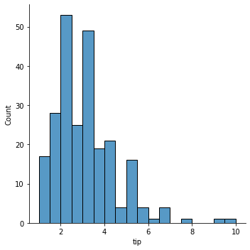
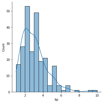
히스토그램
수치형 변수 1개
1 2 3 4 5 6 7 8 9 10 11 12 13 14 15 16
import matplotlib.pyplot as plt import numpy as np import seaborn as sns
# 내장 데이터 titanic = sns.load_dataset('titanic') age = titanic['age']
nbins = 21 fig, ax = plt.subplots(figsize=(10, 6)) ax.hist(age, bins = nbins) # 여기서 bins = nbins는 히스토그램을 더 세밀하게 나누어 준다. ax.set_xlabel("Age") ax.set_ylabel("Frequency") ax.set_title("Distribution of Aae in Titanic") ax.axvline(x = age.mean(), linewidth = 2, color = 'r') fig.show()
Output
코드
설명
.hist()
데이터를 히스토그램으로 표현해주는 메소드
.axvline()
데이터의 평균을 선으로 나타내주는 메소드
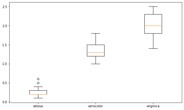
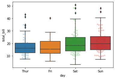
박스플롯
x축 변수: 범주형 변수, 그룹과 관련있는 변수, 문자열
y축 변수: 수치형 변수
1 2 3 4 5 6 7 8 9 10 11 12 13
import matplotlib.pyplot as plt import seaborn as sns
iris = sns.load_dataset('iris')
data = [iris[iris['species']=="setosa"]['petal_width'], iris[iris['species']=="versicolor"]['petal_width'], iris[iris['species']=="virginica"]['petal_width']]
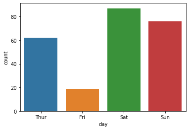
Fri 19
Thur 62
Sun 76
Sat 87
Name: day, dtype: int64
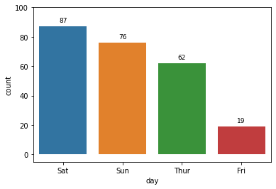
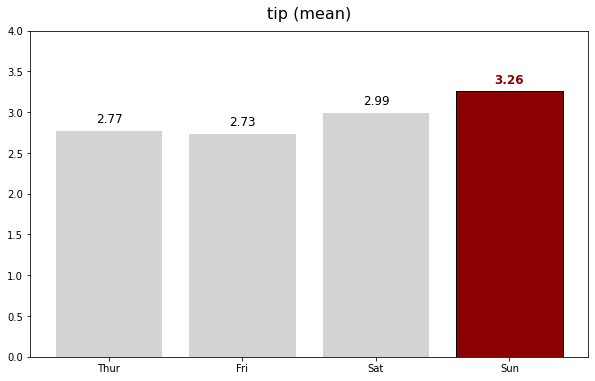
표현할 값이 한 개인 막대 그래프
1 2 3 4 5 6 7
# 기본주석 생략 ax = sns.countplot(x = "day", data = tips, order = tips['day'].value_counts().index) # x축을 'day'로 지정, data는 'tips'로 채워넣음, 'day'의 값이 높은 순서대로 막대그래프 정렬 for p in ax.patches: # ax.patches = p height = p.get_height() # 아래행을 실행하기위해 막대그래프의 높이 가져옴 ax.text(p.get_x() + p.get_width()/2., height+3, height, ha = 'center', size=9) # 막대그래프 위 수치 작성 ax.set_ylim(-5, 100) # y축 최소, 최대범위 plt.show()
Output
나중에 다시 본다면 조금 설명이 필요할 것 같다. 특히 ax.text행의 인자가 조금 많은데 설명이 필요한 듯하다. 직접 colab에서 이것저것 만져본 결과 추측하기로는 다음 표과 같은듯 하다.
코드
설명
p.get_x() + p.get_width()/2.
수치가 들어갈 x축 위지
height+3
y축 위치(현재 +3)
height
수치의 값을 조절할 것인지(현재 +0)
ha = ‘center’
수치를 (x,y)축의 가운데로 정렬
size=9
폰트의 크기이다
여기서 혹시나 ha = 'center'부분이 잘 이해가 안될수 있다.내가그랬다 ha =는 (x,y)축의 기준이 될 곳을 정하는 인자인듯 하다. center말고도 left,right등을 사용할수 있는데 막대의 기준에서 왼쪽,오른쪽이 아닌 텍스트의 기준에서 왼쪽,오른쪽이라 방향을 선택하면 오히려 반대로 배치되는것을 알 수 있다.
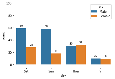
표현할 값이 두 개인 막대 그래프
1 2 3 4 5 6 7 8 9
# 기본주석 생략 ax = sns.countplot(x = "day", data = tips, hue = "sex", dodge = True, order = tips['day'].value_counts().index) for p in ax.patches: height = p.get_height() ax.text(p.get_x() + p.get_width()/2., height+3, height, ha = 'center', size=9) ax.set_ylim(-5, 100)
plt.show()
Output
이 코드에서 첫째줄의 인자를 표로 나타내면
코드
설명
x = “day”
x축이 나타낼 자료
data = tips
표현할 데이터셋
hue = “sex”
그래프로 표현할 항목
dodge = True
항목끼리 나눠서 표현할 것인지
order = tips[‘day’].value_counts().index
‘day’의 값이 높은 순서대로 그래프 정렬
sns.countplot() x축이 나타낼 자료, 나타낼 데이터셋, 그래프로 나타낼 항목, 항목끼리 나눠서 표현할것인지, ‘day’의 값이 높은 순서대로 막대그래프 정렬
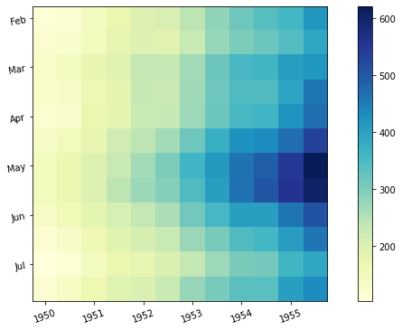
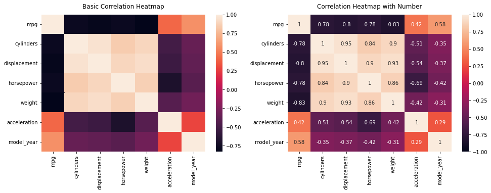
상관관계 그래프
데이터 불러오기 및 행, 열 갯수 표시하기
1
2
3
4
5
6
7
8
9
10
import pandas as pd import numpy as np import seaborn as sns import matplotlib.pyplot as plt
mpg = sns.load_dataset("mpg") print(mpg.shape) # 398 행, 9개 열
num_mpg = mpg.select_dtypes(include = np.number) # num_mpg에 'mpg' 데이터셋의 데이터타입 총갯수를 입력한다(숫자형 데이터타입만 포함) print(num_mpg.shape) # 398 행, 7개 열 (두개가 사라진 이유는 number타입이 아닌 Object타입이기 때문)
# 기본 그래프 [Basic Correlation Heatmap] sns.heatmap(num_mpg.corr(), ax=ax[0]) ax[0].set_title('Basic Correlation Heatmap', pad = 12)
# 상관관계 수치 그래프 [Correlation Heatmap with Number] sns.heatmap(num_mpg.corr(), vmin=-1, vmax=1, annot=True, ax=ax[1]) ax[1].set_title('Correlation Heatmap with Number', pad = 12)
plt.show()
Output
위의 코드에서 pad는 히트맵과 타이틀의 간격설정이며, set_title의 인자를 설명하면 (히트맵을 만들 ‘데이터셋.corr()’, 히트맵의 최소값, 최대값, 수치표현(bool값), 마지막인자는 확실하지는 않지만 앞의 히트맵 설정을 어떤 히트맵에 적용시킬지 묻는것 같다.)
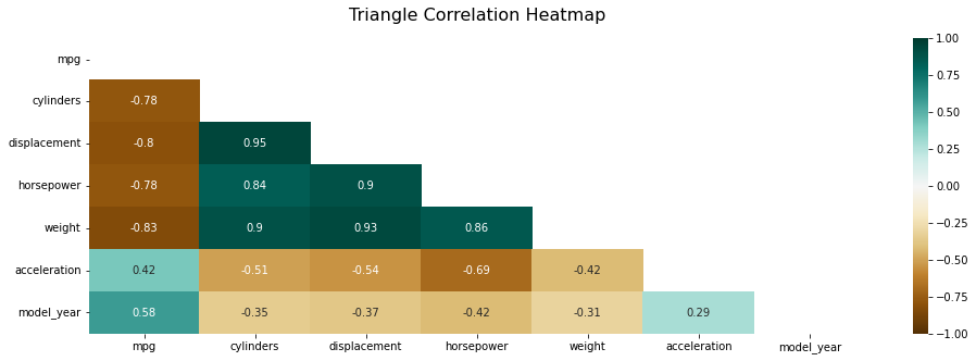
상관관계 배열 만들기
1 2 3 4
# import numpy as np # 윗단 코드에서 만들어진 num_mpg 사용 print(int(True)) np.triu(np.ones_like(num_mpg.corr()))
np.triu(배열, k=0)는 위 결과처럼 우하향 대각선이 있고 위 아래로 삼각형이 있다 생각했을때 아래쪽의 삼각형이 모두 0이 되는 함수이다. k의 숫자가 낮아질수록 삼각형은 한칸씩 작아진다. 위 결과에서 행과 열이 7칸이 된 이유는 np.ones_like(num_mpg.corr())의 행이 7개 이기때문인듯 하다. 확실히 모르겠음 질문 필수
이 챕터의 내용은 코드가 너무 긺으로 시각화 결과물을 접지않고 코드를 접는형식으로 서술하겠음.
필수 코드이므로 생략을 생략
1
2
3
4
import matplotlib.pyplot as plt
from matplotlib.ticker import (MultipleLocator, AutoMinorLocator, FuncFormatter)
import seaborn as sns
import numpy as np
import matplotlib.pyplot as plt from matplotlib.ticker import (MultipleLocator, AutoMinorLocator, FuncFormatter) import seaborn as sns import numpy as np
import matplotlib.pyplot as plt from matplotlib.ticker import (MultipleLocator, AutoMinorLocator, FuncFormatter) import seaborn as sns import numpy as np
import matplotlib.pyplot as plt from matplotlib.ticker import (MultipleLocator, AutoMinorLocator, FuncFormatter) import seaborn as sns import numpy as np