캐글 데이터 시각화 해석-1
임포트 및 데이터프레임 추가
1 | # This Python 3 environment comes with many helpful analytics libraries installed |
1 | from plotly.offline import plot, iplot, init_notebook_mode |
1 | import numpy as np |
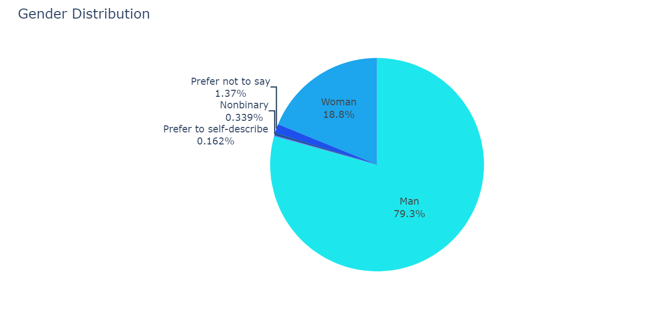
원 그래프 해석
1 | fig = go.Figure( data=[ # 그래프의 형태를 나타내는 함수 |
그래프
코드 해석
1 | fig = go.Figure(data=[ |
fig = go.Figure(data=[
-> 그래프의 기본적인 틀을 설정하는 함수이고, fig에 데이터를 부여해준다.
go.Pie(
-> 그래프의 형태가 파이모양(원그래프)임을 의미한다.
labels = df['Q2'][1:].value_counts().index
-> 그래프로 표현될 값에 붙일 이름이다. 이 코드에서는 ‘df’의 ‘Q2’열에 있는 데이터의 ‘1번인덱스(질문열을 제외하기 위함) 행부터 마지막까지’ 카운트하고 값에따라 분류했을 때의 인덱스열 인 것이다.
values = df['Q2'][1:].value_counts().values
-> 그래프로 표현될 값이다. 이 코드에서는 ‘df’의 ‘Q2’열에 있는 데이터의 ‘1번인덱스 행부터 마지막까지’ 카운트하고 값에따라 분류했을 때의 값(각 값을 카운트한 값) 이다.
textinfo = 'label+percent'
-> 그래프에 표시된 항목에 나타낼 텍스트를 설정한다. 이 코드에서는 항목명(label)과 비율(percent)을 나타낸다.
1 | fig.update_traces( |
fig.update_traces(
-> 추가바람
marker=dict(colors=colors[2:]))
-> 그래프의 색상을 설정한다. 이 코드에서는 위에서 설정된 colors 리스트에서 2번 인덱스부터 순서대로 사용한다.
fig.update_layout(
-> 그래프의 부가정보를 설정한다.
title_text='Gender Distribution'
-> 그래프의 제목을 설정한다.
showlegend=False)
-> 범례의 표기여부를 결정한다. 이 코드에서는 False이므로 범례가 표기되지 않는다.
fig.show()
-> 화면에 그래프를 표시하는 기능을한다. 몇몇에디터에서는 자동으로 표시되기때문에 호출할 필요가 없는 경우가 있다.
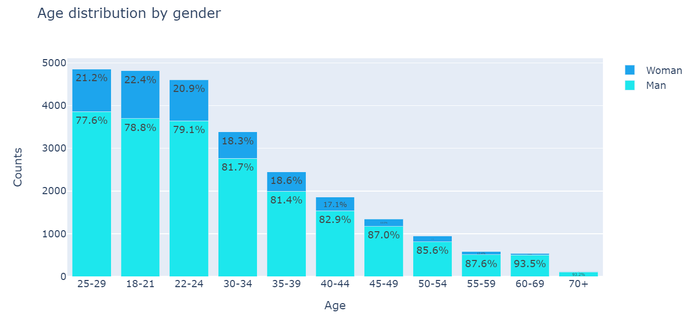
막대그래프 해석
1 | man = df[df['Q2'] == 'Man']['Q1'].value_counts() # 성별이 남성[df['Q2'] == 'Man']인 행에서 나이['Q1']의 값을 카운트하여 시리즈로 만듦. |
그래프
코드 해석
1 | man = df[df['Q2'] == 'Man']['Q1'].value_counts() |
man = df[df['Q2'] == 'Man']['Q1'].value_counts()
-> 성별이 남성[df['Q2'] == 'Man]인 행에서 나이['Q1']의 값을 카운트하여 시리즈를 생성한다.
woman = df[df['Q2'] == 'Woman']['Q1'].value_counts()
-> 성별이 여성[df['Q2'] == 'Woman']인 행에서 나이['Q1']의 값을 카운트하여 시리즈를 생성한다.
textonbar_man = [round((m/(m+w))*100, 1) for m, w in zip(man.values, woman.values)]
-> for문을 사용하여 round함수를 계산 하고 textonbar_man에 저장한다.
textonbar_woman = [round((uw/(m+w))*100, 1) for m, w in zip(man.values, woman.values)]
-> for문을 사용하여 round함수를 계산 하고 textonbar_woman에 저장한다.
1 | fig = go.Figure(data=[ |
go.Bar(
-> 그래프의 모양이 막대모양임을 의미한다.
name='Man', x=man.index, y=man.values,
-> 순서대로 막대의 이름, x축에는 man의 인덱스, y축에는 man의 값을 나타내라는 의미이다.
text=textonbar_man, marker_color=colors[2]),
-> 각각 막대의 값을 작성해줄 텍스트, 막대의 색을 의미한다.
1 | fig.update_traces( |
texttemplate='%{text:.3s}%',
-> fig(print(fig)로 출력가능)내부의 text 인자를 차례대로 출력 (그래프의 위의 텍스트를 표현)
textposition='inside'
-> 그래프상에서의 값의 위치를 설정한다.
barmode='stack'
-> 막대의 형태를 표현한다.
title_text='Age distribution by gender'
-> 그래프의 제목을 설정한다.
xaxis_title='Age', yaxis_title='Counts'
-> 그래프의 x축 제목, y축 제목
몇몇 요소 확인법
print(type(데이터))
-> 데이터의 타입을 출력한다
데이터.head(),데이터.tail()
-> 데이터를 인덱스 순으로 출력한다. head는 처음부터 끝까지, tail은 반대로 출력하며 괄호안에 숫자를 입력하면 숫자만큼 출력한다.
References
go.Figure() properties
update_traces() properties
update_layout() properties
show() properties
go.Bar() properties
install_url to use ShareThis. Please set it in _config.yml.