2021 캐글 대회 코드 작성기 - 2

Q3. In which country do you currently reside?


1
2
3
4
5
6
7
8
9
10
11
12
13
14
15
16
17
18
19
20
years = ['2019', '2021']
JP_country_count_19 = (df19[df19['Q3'] == 'Japan']['Q3']).count()
CN_country_count_19 = (df19[df19['Q3'] == 'China']['Q3']).count()
JP_country_count_21 = (df21[df21['Q3'] == 'Japan']['Q3']).count()
CN_country_count_21 = (df21[df21['Q3'] == 'China']['Q3']).count()

JP_country_count_19_21 = [JP_country_count_19, JP_country_count_21]
CN_country_count_19_21 = [CN_country_count_19, CN_country_count_21]

fig_country = go.Figure(data=[
go.Bar(name='Japan', x=years, y=JP_country_count_19_21, marker_color=JP_colors[0]),
go.Bar(name='China', x=years, y=CN_country_count_19_21, marker_color=CN_colors[1])
])
fig_country.update_layout(
barmode='group',
title_text='2019 & 2021, the number of Kaggler living in Japan and China',
xaxis_title='Years',
yaxis_title='Counts'
)
fig_country.show()

연도별 일본과 중국의 캐글러 수

2019년과 2021년 일본과 중국 캐글러의 수를 비교한 막대그래프이다.
일본은 빨강 중국은 노란색 막대로 표현했으며 일본의 수치가 인구 대비 상당히 높은 걸 알 수 있다.
양국 모두 캐글러의 수치가 증가했다.
2년간 일본은 약 35%, 중국은 약 40%가 증가했으며 증가한 캐글러의 수는 일본이 높지만 비율은 중국이 앞섰다.

Q14. What data visualization libraries or tools do you use on a regular basis?


1
2
3
4
5
6
7
8
9
10
11
12
13
14
15
16
17
18
19
20
21
22
23
24
25
26
27
28
29
30
31
32
33
34
35
36
37
38
39
40
41
42
43
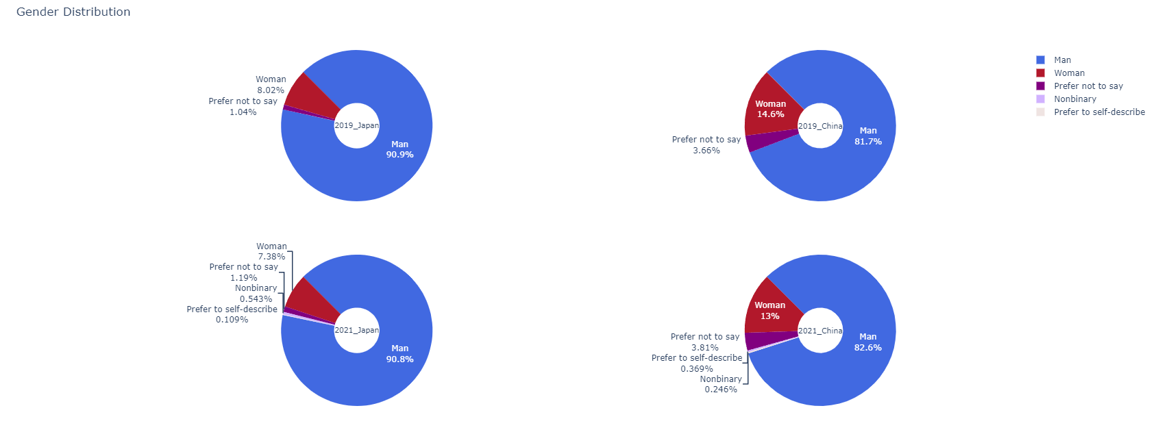
df19_JP = df19[df19.Q3.isin(['Japan'])]
df19_CN = df19[df19.Q3.isin(['China'])]
df21_JP = df21[df21.Q3.isin(['Japan'])]
df21_CN = df21[df21.Q3.isin(['China'])]
df19_JP_Q14 = pd.DataFrame()
df19_CN_Q14 = pd.DataFrame()
df21_JP_Q14 = pd.DataFrame()
df21_CN_Q14 = pd.DataFrame()
df19_JP_Q14['Q20'] = [df19_JP[col][1:].value_counts().index[0] for col in df19_JP.columns[97:109]]
df19_CN_Q14['Q20'] = [df19_CN[col][1:].value_counts().index[0] for col in df19_CN.columns[97:109]]
df21_JP_Q14['Q14'] = [df21_JP[col][1:].value_counts().index[0] for col in df21_JP.columns[59:71]]
df21_CN_Q14['Q14'] = [df21_CN[col][1:].value_counts().index[0] for col in df21_CN.columns[59:71]]
df19_JP_Q14['counts'] = [df19_JP[col][1:].value_counts().values[0] for col in df19_JP.columns[97:109]]
df19_CN_Q14['counts'] = [df19_CN[col][1:].value_counts().values[0] for col in df19_CN.columns[97:109]]
df21_JP_Q14['counts'] = [df21_JP[col][1:].value_counts().values[0] for col in df21_JP.columns[59:71]]
df21_CN_Q14['counts'] = [df21_CN[col][1:].value_counts().values[0] for col in df21_CN.columns[59:71]]

df19_JP_Q14.index = [3,0,6,4,5,2,7,1,8,9,10,11]
df19_CN_Q14.index = [3,0,6,4,5,2,7,1,8,9,10,11]
df19_JP_Q14 = df19_JP_Q14.sort_index()
df19_CN_Q14 = df19_CN_Q14.sort_index()
df21_JP_Q14['Q14'].index = [0,1,2,3,4,5,6,7,8,9,10,11]
df21_CN_Q14['Q14'].index = [0,1,2,3,4,5,6,7,8,9,10,11]
df19_JP_Q14.replace(regex = 'D3.js', value = 'D3 js', inplace = True)
df19_CN_Q14.replace(regex = 'D3.js', value = 'D3 js', inplace = True)

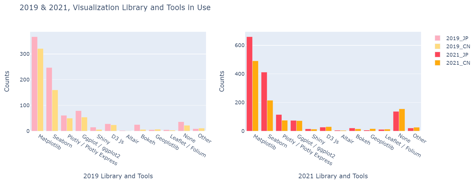
fig_T = make_subplots(rows=1, cols=2, specs=[[{'type':'xy'}, {'type':'xy'}]])

fig_T.add_trace(go.Bar(name=coun_years[0], x=df19_JP_Q14['Q20'].values, y=df19_JP_Q14['counts'], marker_color=coun_years_colors[0]),1,1)
fig_T.add_trace(go.Bar(name=coun_years[1], x=df19_CN_Q14['Q20'].values, y=df19_CN_Q14['counts'], marker_color=coun_years_colors[1]),1,1)
fig_T.add_trace(go.Bar(name=coun_years[2], x=df21_JP_Q14['Q14'].values, y=df21_JP_Q14['counts'], marker_color=coun_years_colors[2]),1,2)
fig_T.add_trace(go.Bar(name=coun_years[3], x=df21_CN_Q14['Q14'].values, y=df21_CN_Q14['counts'], marker_color=coun_years_colors[3]),1,2)

fig_T.update_layout(title_text='2019 & 2021, Visualization Library and Tools in Use',
showlegend=True,
autosize=True)

fig_T.update_xaxes(title_text='2019 Library and Tools', row=1, col=1)
fig_T.update_yaxes(title_test='Counts', row=1, col=1)
fig_T.update_xaxes(title_text='2021 Library and Tools', row=1, col=2)
fig_T.update_yaxes(title_text='Counts', row=1, col=2)

fig_T.show()

연도별 일본과 중국의 시각화 라이브러리 & 툴 사용 그래프

각 그래프를 연도로 나누고 그래프에는 그에 해당하는 라이브러리,툴 사용량을 국가별로 나누어 넣은 막대그래프이다.
양국 모두 전반적으로 증가하였으나 눈에띄는 부분은 중국의 None항목이 크게 늘었고, 중국은 모든 항목의 사용량이 증가한 반면에 일본은 감소세가 보이는 항목이 있었다.

Q16. Which of the following machine learning frameworks do you use on a regular basis?


1
2
3
4
5
6
7
8
9
10
11
12
13
14
15
16
17
fig_F = make_subplots(rows=1, cols=2, specs=[[{'type':'xy'}, {'type':'xy'}]])

fig_F.add_trace(go.Bar(name=coun_years[0], x=df19_JP_Q16['Q28'].values, y=df19_JP_Q16['counts'].sort_values(ascending=False).values, marker_color=coun_years_colors[0]),1,1)
fig_F.add_trace(go.Bar(name=coun_years[1], x=df19_CN_Q16['Q28'].values, y=df19_CN_Q16['counts'].sort_values(ascending=False).values, marker_color=coun_years_colors[1]),1,1)
fig_F.add_trace(go.Bar(name=coun_years[2], x=df21_JP_Q16['Q16'].values, y=df21_JP_Q16['counts'].sort_values(ascending=False).values, marker_color=coun_years_colors[2]),1,2)
fig_F.add_trace(go.Bar(name=coun_years[3], x=df21_CN_Q16['Q16'].values, y=df21_CN_Q16['counts'].sort_values(ascending=False).values, marker_color=coun_years_colors[3]),1,2)

fig_F.update_layout(title_text='2019 & 2021, Machine Learning Frameworks in Use',
showlegend=True,
autosize=True)

fig_F.update_xaxes(title_text='2019 Machine Learning Frameworks', row=1, col=1)
fig_F.update_yaxes(title_text='Counts', row=1, col=1)
fig_F.update_xaxes(title_text='2021 Machine Learning Frameworks', row=1, col=2)
fig_F.update_yaxes(title_text='Counts', row=1, col=2)

fig_F.show()

연도별 일본과 중국의 머신러닝 프레임워크 사용 그래프

이번 질문에대한 답도 비슷하다. 그래프는 연도로 나누고 각각의 x축에는 사용하는 머신러닝 프레임워크, y축에는 그 수가 표기되어 얼마나 많은 캐글러가 머신러닝 프레임워크를 사용하지는 나타낸다.
각 년도의 차이점은 (프레임워크의 사용자의 수는 물론이거니와)프레임워크의 종류가 19년도에 비해 21년에 약증했다는 점이 있고, 특이점이라면 21년 일본의 사이킷런Scikit-learn 사용자의 수가 급증했다는 점이 있다.

2021 캐글 대회 코드 작성기 - 1

파이썬을 배운지 며칠 되지 않아 kaggle이라는 예측모델 및 분석대회 플랫폼의 데이터 분석 대회에 참가하게 되었다.
주제는 2021년 캐글러kaggler들에게 설문조사이며, 그 설문조사 데이터셋을 바탕으로 참가자가 분석을 하여 참가자만의 주제에 그래프와 수치로 답을 찾아내는 대회이다.

데이터셋에 있는 캐글러의 수는 19년 19717명, 21년 25974명, 직업은 데이터사이언스, 데이터 엔지니어부터 학생까지 다양하며, 나이, 학력, 국적, 라이브러리, 언어 등 매우 다양한 항목들이 있다.

우리 조에서 처음으로 선정하려 했던 주제는 한국, 일본, 중국의 캐글러의 트렌드변화로 하려 했으나, 중국, 일본에 비해 데이터가 턱없이 부족해 비교가 무의미한 수준이었기에 캐글러의 수가 비슷한 두 나라인 중국과 일본로 선정했다.(의외로 중국의 캐글러 절대적인 수가 인구에 비해 상당히 적어 일본보다 조금 적은편이였다.)

import(Kaggle notebook)


1
2
3
4
5
6
7
8
9
10
11
12
13
14
15
16
17
import numpy as np 
import pandas as pd
import matplotlib.pyplot as plt
import plotly.express as px
import plotly.graph_objects as go
from warnings import filterwarnings
from plotly.subplots import make_subplots
filterwarnings('ignore')

colors = ['#B1EDED','#B1B2ED','#1DE7ED','#1DA5ED','#1D50ED','#16548E']
gen_colors = ['#4169E1','#B2182B','#81007F','#D1B2FF','#EFE4E2']
JP_colors = ['#D90B0B','#F24444','#EFE4E2','#FCCE88','#64807F']
CN_colors = ['#E0201B','#FFCE3F','#A63F03','#04BF33','#F2E6D8']
coun_years_colors = ['#D90B0B','#FFCE3F','#FF6161','#FFDB81']

df19 = pd.read_csv('../input/kaggle-survey-2019/multiple_choice_responses.csv')
df21 = pd.read_csv('../input/kaggle-survey-2021/kaggle_survey_2021_responses.csv')

이처럼 후에 사용할 라이브러리를 임포트, 그래프에 사용할 색을 리스트로 만들어주고 df19에 19년의 데이터셋을, df21에 21년의 데이터셋을 넣어준다.

사용자 지정 함수


1
2
3
4
5
6
7
8
9
10
def group(data, country, question_num):
return data[data['Q3'] == country][question_num].value_counts()

def go_Pie(country, label_value):
return go.Pie(title = country,
labels = label_value.index,
values = label_value.values,
textinfo = 'label+percent',
rotation=315,
hole = .3,)

앞으로 코드에서 사용될 함수이다.
사용자 지정 함수란?

Q1. What`s your age?


1
2
3
4
5
6
7
8
9
10
11
12
13
14
15
16
17
18
19
20
21
22
23
24
25
26
27
28
JP_age_19 = group(df19,'Japan','Q1').sort_index()

JP_age_21 = group(df21,'Japan','Q1').sort_index()

CN_age_19 = group(df19,'China','Q1')
CN_age_19.loc['55-59'] = 0
CN_age_19.loc['60-69'] = 0
CN_age_19 = CN_age_19.sort_index()

CN_age_21 = group(df21,'China','Q1')
CN_age_21.loc['60-69'] = 0
CN_age_21 = CN_age_21.sort_index()

fig_age = make_subplots(rows=1, cols=2, specs=[[{'type':'xy'}, {'type':'xy'}]])

fig_age.add_trace(go.Bar(name=coun_years[0], x=JP_age_19.index, y=JP_age_19.values, marker_color='#FDB0C0'),1,1)
fig_age.add_trace(go.Bar(name=coun_years[2], x=JP_age_21.index, y=JP_age_21.values, marker_color='#FD4659'),1,1)
fig_age.add_trace(go.Bar(name=coun_years[1], x=CN_age_19.index, y=CN_age_19.values, marker_color='#FFDB81'),1,2)
fig_age.add_trace(go.Bar(name=coun_years[3], x=CN_age_21.index, y=CN_age_21.values, marker_color='#FFAB0F'),1,2)

fig_age.update_layout(barmode='group', title_text='2019 & 2021, Japan and China age distribution', showlegend=True)

fig_age.update_xaxes(title_text='Japan Age distribution', row=1, col=1)
fig_age.update_yaxes(title_text='Counts', row=1, col=1)
fig_age.update_xaxes(title_text='China Age distribution', row=1, col=2)
fig_age.update_yaxes(title_text='Counts', row=1, col=2)

fig_age.show()

일본, 중국 캐글러의 나이분포

첫번째 주제인 What`s your age?에 대한 일본과 중국의 캐글러 나이분포를 막대그래프로 나타낸 것이다.
각 그래프는 연도별로 나눈 일,중 캐글러의 나이 분포이고 그래프의 항목은 18세부터 70세 이상까지 3,4년씩을 한 항목으로 묶었다.

Q2. What`s your gender?


1
2
3
4
5
6
7
8
9
10
11
12
13
14
15
16
17
18
19
20
21
22
23
24
25
26
27
28
29
30
31
32
33
34
35
36
37
38
39
40
41
JP_ndarray = df19[df19['Q3'] == 'Japan']['Q2'].values
CN_ndarray = df19[df19['Q3'] == 'China']['Q2'].values
JP_age_list = []
CN_age_list = []

for item in JP_ndarray:
if item == 'Male':
item_mod = item.replace('Male','Man')
JP_age_list.append(item_mod)
elif item == 'Female':
item_mod2 = item.replace('Female','Woman')
JP_age_list.append(item_mod2)
else :
JP_age_list.append(item)

for item in CN_ndarray:
if item == 'Male':
item_mod = item.replace('Male','Man')
CN_age_list.append(item_mod)
elif item == 'Female':
item_mod2 = item.replace('Female','Woman')
else :
CN_age_list.append(item)

JP_age_series = pd.Series(JP_age_list)
CN_age_series = pd.Series(CN_age_list)

fig = make_subplots(rows=2, cols=2, specs=[[{'type':'domain'}, {'type':'domain'}],
[{'type':'domain'}, {'type':'domain'}]])

fig.add_trace(go_Pie('2019_Japan', JP_age_series.value_counts()),1,1)
fig.add_trace(go_Pie('2019_China', CN_age_series.value_counts()),1,2)
fig.add_trace(go_Pie('2021_Japan', group(df21,'Japan','Q2')),2,1)
fig.add_trace(go_Pie('2021_China', group(df21,'China','Q2')),2,2)

fig.update_traces(marker=dict(colors=gen_colors[0:]))
fig.update_layout(title_text='Gender Distribution',
showlegend=True,
autosize=True,
height=700)
fig.show()

일본, 중국 캐글러의 성별분포

두번쨰 질문에 답하기 위해 일본과 중국의 캐글러 성별분포를 도넛모양으로 나타낸 그래프이다.
각각의 그래프는 국가,년도(2019, 2021)별로 각각 나누었고 그래프의 항목은
Man
Woman
Prefer not to say
Nonbinary
Prefer to self-describe
이렇게 다섯가지로 나누었다.

References

plotly bar chart tutorial
plotly bar chart properties (bar traces)
plotly pie chart tutorial
plotly pie chart properties (pie traces)

캐글 데이터 시각화 해석-1

임포트 및 데이터프레임 추가
1
2
3
4
5
6
7
8
9
10
11
12
13
14
15
16
17
# This Python 3 environment comes with many helpful analytics libraries installed
# It is defined by the kaggle/python Docker image: https://github.com/kaggle/docker-python
# For example, here's several helpful packages to load

import numpy as np # linear algebra
import pandas as pd # data processing, CSV file I/O (e.g. pd.read_csv)

# Input data files are available in the read-only "../input/" directory
# For example, running this (by clicking run or pressing Shift+Enter) will list all files under the input directory

import os
for dirname, _, filenames in os.walk('/kaggle/input'):
for filename in filenames:
print(os.path.join(dirname, filename))

# You can write up to 20GB to the current directory (/kaggle/working/) that gets preserved as output when you create a version using "Save & Run All"
# You can also write temporary files to /kaggle/temp/, but they won't be saved outside of the current session
1
2
from plotly.offline import plot, iplot, init_notebook_mode
init_notebook_mode(connected=True)
1
2
3
4
5
6
7
8
9
10
11
12
import numpy as np
import pandas as pd
import matplotlib.pyplot as plt
import plotly.express as px
import plotly.graph_objects as go
from warnings import filterwarnings
filterwarnings('ignore')

colors = ['#B1EDED','#B1B2ED','#1DE7ED','#1DA5ED','#1D50ED','#16548E']

df = pd.read_csv('../input/kaggle-survey-2021/kaggle_survey_2021_responses.csv')
df.head()

원 그래프 해석


1
2
3
4
5
6
7
8
9
10
11
fig = go.Figure( data=[ # 그래프의 형태를 나타내는 함수
go.Pie( # 원그래프
labels = df['Q2'][1:].value_counts().index, # 값에 붙일 이름 - df['Q2'][1:].value_counts()의 인덱스
values = df['Q2'][1:].value_counts().values, # 나타낼 값 - df['Q2'][1:].value_counts()의 값
textinfo = 'label+percent')]) # 그래프 항목당 나타낼 텍스트 (여기서는 항목명, 비율)
fig.update_traces(
marker=dict(colors=colors[2:])) # 그래프를 어떤 색으로 표현할 것인지
fig.update_layout( # 그래프의 레이아웃 설정
title_text='Gender Distribution', # 그래프의 제목
showlegend=False) # 범례표시여부
fig.show()
그래프

원 그래프

코드 해석
1
2
3
4
5
6
fig = go.Figure(data=[
go.Pie(
labels = df['Q2'][1:].value_counts().index,
values = df['Q2'][1:].value_counts().values,
textinfo = 'label+percent'
)])

fig = go.Figure(data=[
-> 그래프의 기본적인 틀을 설정하는 함수이고, fig에 데이터를 부여해준다.

go.Pie(
-> 그래프의 형태가 파이모양(원그래프)임을 의미한다.

labels = df['Q2'][1:].value_counts().index
-> 그래프로 표현될 값에 붙일 이름이다. 이 코드에서는 ‘df’의 ‘Q2’열에 있는 데이터의 ‘1번인덱스(질문열을 제외하기 위함) 행부터 마지막까지’ 카운트하고 값에따라 분류했을 때의 인덱스열 인 것이다.

values = df['Q2'][1:].value_counts().values
-> 그래프로 표현될 값이다. 이 코드에서는 ‘df’의 ‘Q2’열에 있는 데이터의 ‘1번인덱스 행부터 마지막까지’ 카운트하고 값에따라 분류했을 때의 값(각 값을 카운트한 값) 이다.

textinfo = 'label+percent'
-> 그래프에 표시된 항목에 나타낼 텍스트를 설정한다. 이 코드에서는 항목명(label)과 비율(percent)을 나타낸다.


1
2
3
4
5
6
fig.update_traces( 
marker=dict(colors=colors[2:])) # 그래프를 어떤 색으로 표현할 것인가를 설정
fig.update_layout( # 그래프의 부가정보 설정
title_text='Gender Distribution', # 그래프 제목
showlegend=False) # 범례표시여부
fig.show()

fig.update_traces(
-> 추가바람

marker=dict(colors=colors[2:]))
-> 그래프의 색상을 설정한다. 이 코드에서는 위에서 설정된 colors 리스트에서 2번 인덱스부터 순서대로 사용한다.

fig.update_layout(
-> 그래프의 부가정보를 설정한다.

title_text='Gender Distribution'
-> 그래프의 제목을 설정한다.

showlegend=False)
-> 범례의 표기여부를 결정한다. 이 코드에서는 False이므로 범례가 표기되지 않는다.

fig.show()
-> 화면에 그래프를 표시하는 기능을한다. 몇몇에디터에서는 자동으로 표시되기때문에 호출할 필요가 없는 경우가 있다.

막대그래프 해석


1
2
3
4
5
6
7
8
9
10
11
12
13
14
15
16
17
18
19
20
21
22
23
24
25
26
27
28
29
30
31
man = df[df['Q2'] == 'Man']['Q1'].value_counts() # 성별이 남성[df['Q2'] == 'Man']인 행에서 나이['Q1']의 값을 카운트하여 시리즈로 만듦.
woman = df[df['Q2'] == 'Woman']['Q1'].value_counts() # 성별이 여성[df['Q2'] == 'Woman']인 행에서 나이['Q1']의 값을 카운트하여 시리즈로 만듦.
textonbar_man = [ # list comprehension = [(변수를 활용한 값) for (사용할 변수 이름) in (순회 할 수 있는 값)]
round((m/(m+w))*100, 1) for m, w in zip(man.values, woman.values)] # for문을 사용하여 round함수의 계산을 하고 textonbar_man에 저장
textonbar_woman = [ # list comprehension
round((w/(m+w))*100, 1) for m, w in zip(man.values, woman.values)]

# go = graph_objects
fig = go.Figure(data=[
go.Bar( # 막대그래프
name='Man', # 그래프로 나타낼 항목
x=man.index, # x축에 man의 인덱스
y=man.values, # y축에 man의 값
text=textonbar_man, # 막대의 값을 작성해줄 텍스트
marker_color=colors[2]), #막대 색
go.Bar(
name='Woman',
x=woman.index,
y=woman.values,
text=textonbar_woman,
marker_color=colors[3])
])
fig.update_traces(
texttemplate='%{text:.3s}%', # fig(print(fig)로 출력가능)내부의 text 인자를 차례대로 출력 (그래프의 위의 텍스트를 표현)
textposition='inside') # 그래프상에서 값의 위치
fig.update_layout(
barmode='stack', # 막대의 형태
title_text='Age distribution by gender', # 그래프 제목
xaxis_title='Age', # x축 제목
yaxis_title='Counts') # y축 제목
fig.show()
그래프

막대 그래프

코드 해석
1
2
3
4
man = df[df['Q2'] == 'Man']['Q1'].value_counts()
woman = df[df['Q2'] == 'Woman']['Q1'].value_counts()
textonbar_man = [ round((m/(m+w))*100, 1) for m, w in zip(man.values, woman.values)]
textonbar_woman = [ round((w/(m+w))*100, 1) for m, w in zip(man.values, woman.values)]

man = df[df['Q2'] == 'Man']['Q1'].value_counts()
-> 성별이 남성[df['Q2'] == 'Man]인 행에서 나이['Q1']의 값을 카운트하여 시리즈를 생성한다.

woman = df[df['Q2'] == 'Woman']['Q1'].value_counts()
-> 성별이 여성[df['Q2'] == 'Woman']인 행에서 나이['Q1']의 값을 카운트하여 시리즈를 생성한다.

textonbar_man = [round((m/(m+w))*100, 1) for m, w in zip(man.values, woman.values)]
-> for문을 사용하여 round함수를 계산 하고 textonbar_man에 저장한다.

textonbar_woman = [round((uw/(m+w))*100, 1) for m, w in zip(man.values, woman.values)]
-> for문을 사용하여 round함수를 계산 하고 textonbar_woman에 저장한다.


1
2
3
4
5
6
7
8
9
10
fig = go.Figure(data=[
go.Bar(
name='Man', x=man.index, y=man.values,
text=textonbar_man, marker_color=colors[2]
),
go.Bar(
name='Woman', x=woman.index, y=woman.values,
text=textonbar_woman, marker_color=colors[3]
)
])

go.Bar(
-> 그래프의 모양이 막대모양임을 의미한다.

name='Man', x=man.index, y=man.values,
-> 순서대로 막대의 이름, x축에는 man의 인덱스, y축에는 man의 값을 나타내라는 의미이다.

text=textonbar_man, marker_color=colors[2]),
-> 각각 막대의 값을 작성해줄 텍스트, 막대의 색을 의미한다.


1
2
3
4
5
6
7
8
9
fig.update_traces(
texttemplate='%{text:.3s}%',
textposition='inside')
fig.update_layout(
barmode='stack',
title_text='Age distribution by gender',
xaxis_title='Age', yaxis_title='Counts')
fig.show()
)

texttemplate='%{text:.3s}%',
-> fig(print(fig)로 출력가능)내부의 text 인자를 차례대로 출력 (그래프의 위의 텍스트를 표현)

textposition='inside'
-> 그래프상에서의 값의 위치를 설정한다.

barmode='stack'
-> 막대의 형태를 표현한다.

title_text='Age distribution by gender'
-> 그래프의 제목을 설정한다.

xaxis_title='Age', yaxis_title='Counts'
-> 그래프의 x축 제목, y축 제목

몇몇 요소 확인법


print(type(데이터))
-> 데이터의 타입을 출력한다

데이터.head(),데이터.tail()
-> 데이터를 인덱스 순으로 출력한다. head는 처음부터 끝까지, tail은 반대로 출력하며 괄호안에 숫자를 입력하면 숫자만큼 출력한다.

References

go.Figure() properties
update_traces() properties
update_layout() properties
show() properties
go.Bar() properties