plotly를 사용하여 막대그래프 만들기

캐글 대회에 참가하면서 파이썬 문법이나 plotly의 특성에 대해 구글링하는 시간이 훨씬 늘었다.
앞으로도 대회에 참가하거나 시각화를 할 때에 이렇게나 많은 특성을 모두 외울수는 없으니 구글링을 하게 될 텐데, 자주쓰는 속성이나 기본틀에 대해서는 포스팅을 해두고 바로바로 찾아보는것이 좋겠다는 생각이 들었다.

그래서 이번 포스팅에서는 앞으로 자주 사용하게 될 차트 중 하나인 막대그래프의 기본 틀과 자주 사용되는 속성에 대해 포스팅 하려 한다.

데이터는 2021 Kaggle Machine Learning & Data Science Survey 대회의 데이터를 사용한다.

import 및 데이터 불러오기

1
2
3
4
5
import plotly.graph_objects as go
import pandas as pd
from plotly.subplots import make_subplots

df21 = pd.read_csv('../input/kaggle-survey-2021/kaggle_survey_2021_responses.csv')

필요한 라이브러리를 import 해주고 데이터를 불러와 저장해준다.
필자는 캐글노트북에서 작성하여 data add 기능으로 kaggle에 있는 데이터를 바로 불러왔지만 로컬이나 colab, jupyter등의 다른 노트북을 사용중이라면 데이터를 다운받은후 괄호안의 경로를 재설정해주어야 한다.
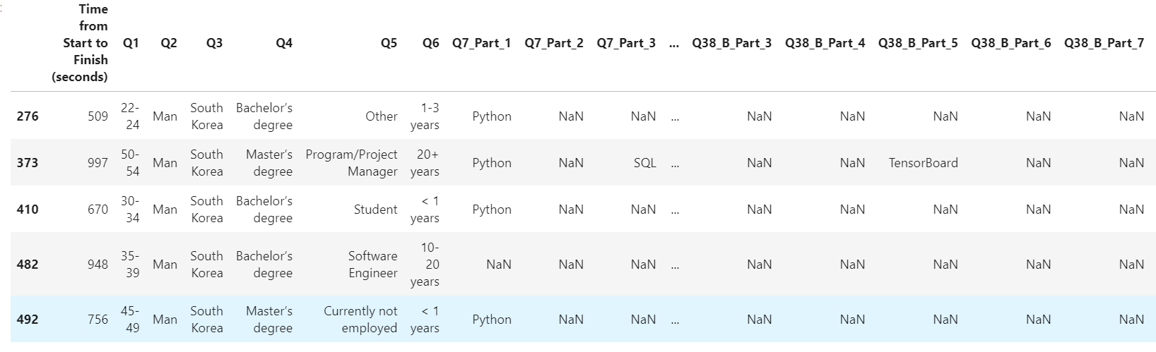
출력할 데이터 확인

1
df21[0:5][Q1,Q14] # Q1,Q14 항목의 값 0부터 4까지 출력
Q1 Q3
0 What is your age (# years)? In which country do you currently reside?
1 50-54 India
2 50-54 Indonesia
3 22-24 Pakistan
4 45-49 Mexico

이렇게 출력하거나

1
df21[df21['Q3'] == "South Korea"] # Q3 항목의 값이 "South Korea"인 행의 데이터프레임 출력

조건을 지정해 데이터를 출력해냄
위 코드처럼 어느 조건에 해당하는행을 출력 할 수도 있다.
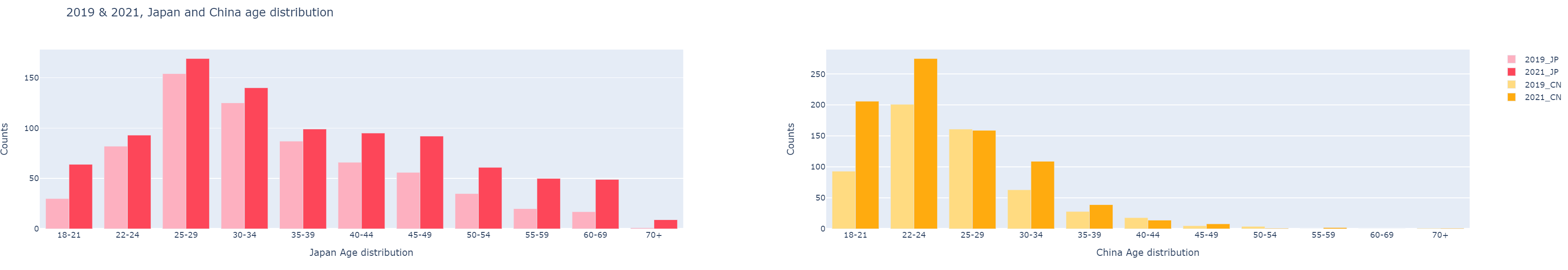
1
2
KR_Age = df21[df21['Q3'] == 'South Korea']['Q1'].value_counts()
JP_Age = df21[df21['Q3'] == 'Japan']['Q1'].value_counts()

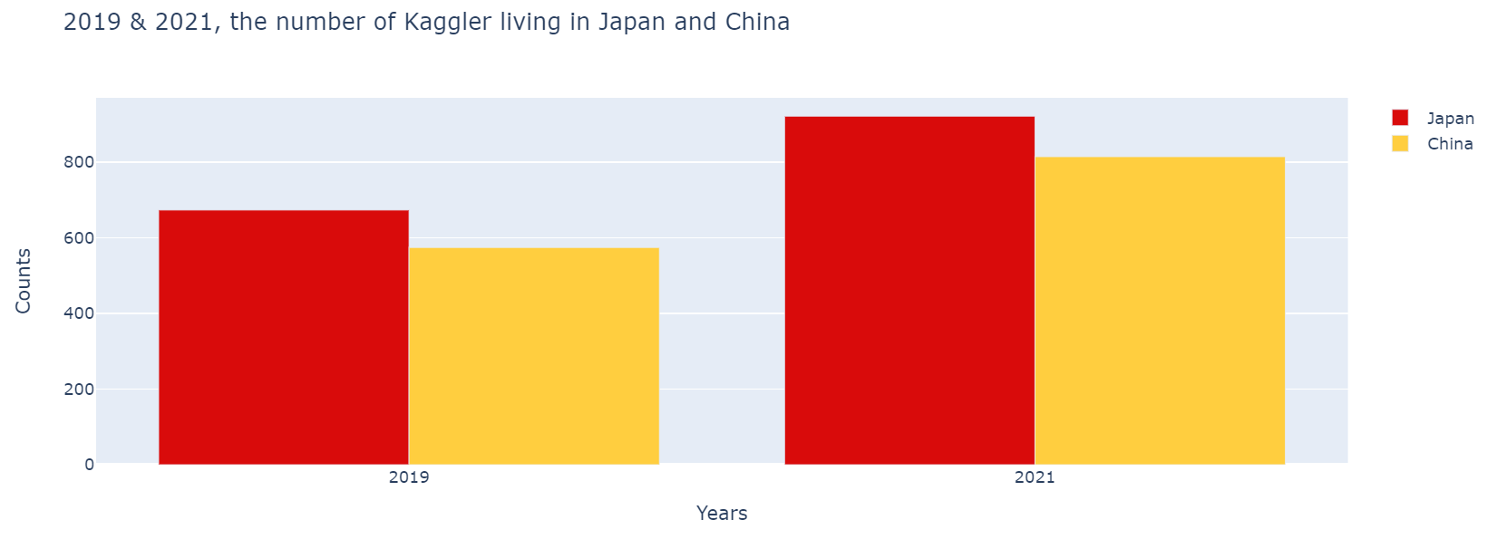
위 코드는 Q3(국가)이 South Korea인 행과 Japan인 행의 Q1(연령)값을 뽑아내는 코드로 이를 통해 그래프를 만들어 볼 것이다.

다중 차트 틀 만들기

위에서 import한 make_subplots으로 차트여러개를 출력 할 수 있다.

1
fig = make_subplots(rows=1, cols=2, specs=[[{'type':'xy'}, {'type':'xy'}]])

fig 객체를 생성해주고 차트를 1행, 2열로 만들어주는 코드이다.
막대그래프의 경우엔 'type':'xy' 파이그래프의 경우엔 'type':'domain'으로 할수있다.
specs에서 중괄호는 차트한개를 나타내며 내부의 중괄호가 여러개라면 각각 행을 구분하는 용도로 쓰인다.

각 속성으로 차트 그리기

1
2
3
4
5
6
7
8
9
10
11
fig.add_trace(go.Bar(name='Korea', x=KR_Age.index, y=KR_Age.values, marker_color='red'),1,1)
fig.add_trace(go.Bar(name='Japan', x=JP_Age.index, y=JP_Age.values, marker_color='blue'),1,2)

fig.update_layout(barmode='group', title_text='2021, Korea and Japan age distribution', showlegend=True)

fig.update_xaxes(title_text='Korea Age distribution', row=1, col=1)
fig.update_yaxes(title_text='Counts', row=1, col=1)
fig.update_xaxes(title_text='Japan Age distribution', row=1, col=2)
fig.update_yaxes(title_text='Counts', row=1, col=2)

fig.show()

파라미터값을 바꾸어 그래프를 출력
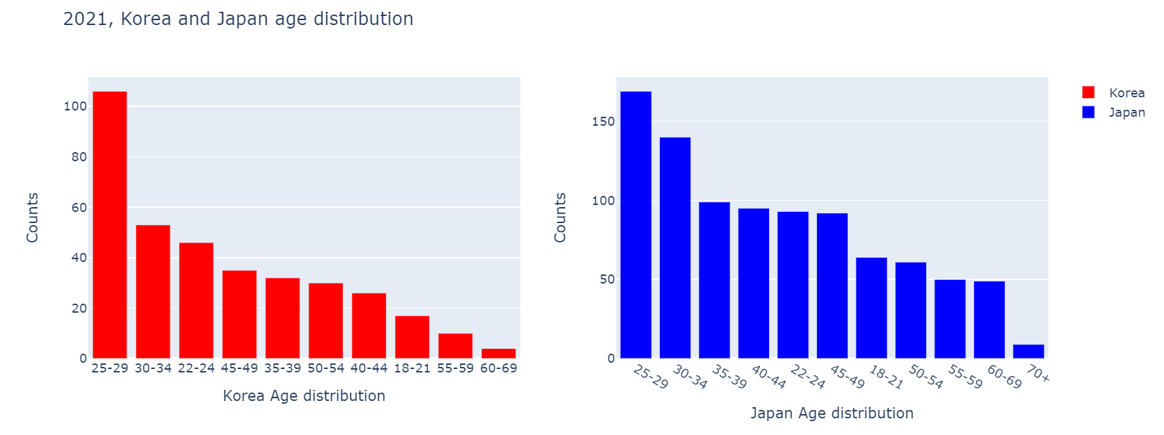
add_trace, update_layout 등의 파라미터(속성)값으로 그래프를 꾸미는 코드이다.


fig.add_trace(go.Bar(name='Korea', x=KR_Age.index, y=KR_Age.values, marker_color='red'),1,1)부터 살펴보면
go.Bar는 막대그래프를 뜻한다, 각 파라미터를 살펴보면
name는 그래프에 표현되는 항목의 이름,
x는 그래프의 x축이 나타낼 항목,
y는 그래프의 y축이 나타낼 값,
marker_color은 그래프의 색을 표현하며
가장 끝의1,1는 위 항목이 표시될 그래프의 행,열을 뜻한다.(그러니 1번째 행 1번째 열의 그래프에 Korea 항목이 들어간다.)


fig.update_layout(barmode='group', title_text='2021, Korea and Japan age distribution', showlegend=True)도 뜯어보겠다.
barmode는 한 그래프에 여러 항목이 들어있을 경우 어떻게 나타내는지에 대한 속성인데 대표적으로 groupstack이 있다.
title_text는 제목, showlegend는 범례 표기 여부를 가리킨다.


마지막의 fig.show()는 fig객체를 출력하는 코드이다.

아래 References에 막대그래프의 파라미터가 정리되있는 링크를 걸어놓을테니 활용하여 다양하게 그래프를 만들어보자.

References

2021 캐글 대회 코드 작성기 - 2

Q3. In which country do you currently reside?


1
2
3
4
5
6
7
8
9
10
11
12
13
14
15
16
17
18
19
20
years = ['2019', '2021']
JP_country_count_19 = (df19[df19['Q3'] == 'Japan']['Q3']).count()
CN_country_count_19 = (df19[df19['Q3'] == 'China']['Q3']).count()
JP_country_count_21 = (df21[df21['Q3'] == 'Japan']['Q3']).count()
CN_country_count_21 = (df21[df21['Q3'] == 'China']['Q3']).count()

JP_country_count_19_21 = [JP_country_count_19, JP_country_count_21]
CN_country_count_19_21 = [CN_country_count_19, CN_country_count_21]

fig_country = go.Figure(data=[
go.Bar(name='Japan', x=years, y=JP_country_count_19_21, marker_color=JP_colors[0]),
go.Bar(name='China', x=years, y=CN_country_count_19_21, marker_color=CN_colors[1])
])
fig_country.update_layout(
barmode='group',
title_text='2019 & 2021, the number of Kaggler living in Japan and China',
xaxis_title='Years',
yaxis_title='Counts'
)
fig_country.show()

연도별 일본과 중국의 캐글러 수

2019년과 2021년 일본과 중국 캐글러의 수를 비교한 막대그래프이다.
일본은 빨강 중국은 노란색 막대로 표현했으며 일본의 수치가 인구 대비 상당히 높은 걸 알 수 있다.
양국 모두 캐글러의 수치가 증가했다.
2년간 일본은 약 35%, 중국은 약 40%가 증가했으며 증가한 캐글러의 수는 일본이 높지만 비율은 중국이 앞섰다.

Q14. What data visualization libraries or tools do you use on a regular basis?


1
2
3
4
5
6
7
8
9
10
11
12
13
14
15
16
17
18
19
20
21
22
23
24
25
26
27
28
29
30
31
32
33
34
35
36
37
38
39
40
41
42
43
df19_JP = df19[df19.Q3.isin(['Japan'])]
df19_CN = df19[df19.Q3.isin(['China'])]
df21_JP = df21[df21.Q3.isin(['Japan'])]
df21_CN = df21[df21.Q3.isin(['China'])]
df19_JP_Q14 = pd.DataFrame()
df19_CN_Q14 = pd.DataFrame()
df21_JP_Q14 = pd.DataFrame()
df21_CN_Q14 = pd.DataFrame()
df19_JP_Q14['Q20'] = [df19_JP[col][1:].value_counts().index[0] for col in df19_JP.columns[97:109]]
df19_CN_Q14['Q20'] = [df19_CN[col][1:].value_counts().index[0] for col in df19_CN.columns[97:109]]
df21_JP_Q14['Q14'] = [df21_JP[col][1:].value_counts().index[0] for col in df21_JP.columns[59:71]]
df21_CN_Q14['Q14'] = [df21_CN[col][1:].value_counts().index[0] for col in df21_CN.columns[59:71]]
df19_JP_Q14['counts'] = [df19_JP[col][1:].value_counts().values[0] for col in df19_JP.columns[97:109]]
df19_CN_Q14['counts'] = [df19_CN[col][1:].value_counts().values[0] for col in df19_CN.columns[97:109]]
df21_JP_Q14['counts'] = [df21_JP[col][1:].value_counts().values[0] for col in df21_JP.columns[59:71]]
df21_CN_Q14['counts'] = [df21_CN[col][1:].value_counts().values[0] for col in df21_CN.columns[59:71]]

df19_JP_Q14.index = [3,0,6,4,5,2,7,1,8,9,10,11]
df19_CN_Q14.index = [3,0,6,4,5,2,7,1,8,9,10,11]
df19_JP_Q14 = df19_JP_Q14.sort_index()
df19_CN_Q14 = df19_CN_Q14.sort_index()
df21_JP_Q14['Q14'].index = [0,1,2,3,4,5,6,7,8,9,10,11]
df21_CN_Q14['Q14'].index = [0,1,2,3,4,5,6,7,8,9,10,11]
df19_JP_Q14.replace(regex = 'D3.js', value = 'D3 js', inplace = True)
df19_CN_Q14.replace(regex = 'D3.js', value = 'D3 js', inplace = True)

fig_T = make_subplots(rows=1, cols=2, specs=[[{'type':'xy'}, {'type':'xy'}]])

fig_T.add_trace(go.Bar(name=coun_years[0], x=df19_JP_Q14['Q20'].values, y=df19_JP_Q14['counts'], marker_color=coun_years_colors[0]),1,1)
fig_T.add_trace(go.Bar(name=coun_years[1], x=df19_CN_Q14['Q20'].values, y=df19_CN_Q14['counts'], marker_color=coun_years_colors[1]),1,1)
fig_T.add_trace(go.Bar(name=coun_years[2], x=df21_JP_Q14['Q14'].values, y=df21_JP_Q14['counts'], marker_color=coun_years_colors[2]),1,2)
fig_T.add_trace(go.Bar(name=coun_years[3], x=df21_CN_Q14['Q14'].values, y=df21_CN_Q14['counts'], marker_color=coun_years_colors[3]),1,2)

fig_T.update_layout(title_text='2019 & 2021, Visualization Library and Tools in Use',
showlegend=True,
autosize=True)

fig_T.update_xaxes(title_text='2019 Library and Tools', row=1, col=1)
fig_T.update_yaxes(title_test='Counts', row=1, col=1)
fig_T.update_xaxes(title_text='2021 Library and Tools', row=1, col=2)
fig_T.update_yaxes(title_text='Counts', row=1, col=2)

fig_T.show()

연도별 일본과 중국의 시각화 라이브러리 & 툴 사용 그래프

각 그래프를 연도로 나누고 그래프에는 그에 해당하는 라이브러리,툴 사용량을 국가별로 나누어 넣은 막대그래프이다.
양국 모두 전반적으로 증가하였으나 눈에띄는 부분은 중국의 None항목이 크게 늘었고, 중국은 모든 항목의 사용량이 증가한 반면에 일본은 감소세가 보이는 항목이 있었다.

Q16. Which of the following machine learning frameworks do you use on a regular basis?


1
2
3
4
5
6
7
8
9
10
11
12
13
14
15
16
17
fig_F = make_subplots(rows=1, cols=2, specs=[[{'type':'xy'}, {'type':'xy'}]])

fig_F.add_trace(go.Bar(name=coun_years[0], x=df19_JP_Q16['Q28'].values, y=df19_JP_Q16['counts'].sort_values(ascending=False).values, marker_color=coun_years_colors[0]),1,1)
fig_F.add_trace(go.Bar(name=coun_years[1], x=df19_CN_Q16['Q28'].values, y=df19_CN_Q16['counts'].sort_values(ascending=False).values, marker_color=coun_years_colors[1]),1,1)
fig_F.add_trace(go.Bar(name=coun_years[2], x=df21_JP_Q16['Q16'].values, y=df21_JP_Q16['counts'].sort_values(ascending=False).values, marker_color=coun_years_colors[2]),1,2)
fig_F.add_trace(go.Bar(name=coun_years[3], x=df21_CN_Q16['Q16'].values, y=df21_CN_Q16['counts'].sort_values(ascending=False).values, marker_color=coun_years_colors[3]),1,2)

fig_F.update_layout(title_text='2019 & 2021, Machine Learning Frameworks in Use',
showlegend=True,
autosize=True)

fig_F.update_xaxes(title_text='2019 Machine Learning Frameworks', row=1, col=1)
fig_F.update_yaxes(title_text='Counts', row=1, col=1)
fig_F.update_xaxes(title_text='2021 Machine Learning Frameworks', row=1, col=2)
fig_F.update_yaxes(title_text='Counts', row=1, col=2)

fig_F.show()

연도별 일본과 중국의 머신러닝 프레임워크 사용 그래프

이번 질문에대한 답도 비슷하다. 그래프는 연도로 나누고 각각의 x축에는 사용하는 머신러닝 프레임워크, y축에는 그 수가 표기되어 얼마나 많은 캐글러가 머신러닝 프레임워크를 사용하지는 나타낸다.
각 년도의 차이점은 (프레임워크의 사용자의 수는 물론이거니와)프레임워크의 종류가 19년도에 비해 21년에 약증했다는 점이 있고, 특이점이라면 21년 일본의 사이킷런Scikit-learn 사용자의 수가 급증했다는 점이 있다.

2021 캐글 대회 코드 작성기 - 1

파이썬을 배운지 며칠 되지 않아 kaggle이라는 예측모델 및 분석대회 플랫폼의 데이터 분석 대회에 참가하게 되었다.
주제는 2021년 캐글러kaggler들에게 설문조사이며, 그 설문조사 데이터셋을 바탕으로 참가자가 분석을 하여 참가자만의 주제에 그래프와 수치로 답을 찾아내는 대회이다.

데이터셋에 있는 캐글러의 수는 19년 19717명, 21년 25974명, 직업은 데이터사이언스, 데이터 엔지니어부터 학생까지 다양하며, 나이, 학력, 국적, 라이브러리, 언어 등 매우 다양한 항목들이 있다.

우리 조에서 처음으로 선정하려 했던 주제는 한국, 일본, 중국의 캐글러의 트렌드변화로 하려 했으나, 중국, 일본에 비해 데이터가 턱없이 부족해 비교가 무의미한 수준이었기에 캐글러의 수가 비슷한 두 나라인 중국과 일본로 선정했다.(의외로 중국의 캐글러 절대적인 수가 인구에 비해 상당히 적어 일본보다 조금 적은편이였다.)

import(Kaggle notebook)


1
2
3
4
5
6
7
8
9
10
11
12
13
14
15
16
17
import numpy as np 
import pandas as pd
import matplotlib.pyplot as plt
import plotly.express as px
import plotly.graph_objects as go
from warnings import filterwarnings
from plotly.subplots import make_subplots
filterwarnings('ignore')

colors = ['#B1EDED','#B1B2ED','#1DE7ED','#1DA5ED','#1D50ED','#16548E']
gen_colors = ['#4169E1','#B2182B','#81007F','#D1B2FF','#EFE4E2']
JP_colors = ['#D90B0B','#F24444','#EFE4E2','#FCCE88','#64807F']
CN_colors = ['#E0201B','#FFCE3F','#A63F03','#04BF33','#F2E6D8']
coun_years_colors = ['#D90B0B','#FFCE3F','#FF6161','#FFDB81']

df19 = pd.read_csv('../input/kaggle-survey-2019/multiple_choice_responses.csv')
df21 = pd.read_csv('../input/kaggle-survey-2021/kaggle_survey_2021_responses.csv')

이처럼 후에 사용할 라이브러리를 임포트, 그래프에 사용할 색을 리스트로 만들어주고 df19에 19년의 데이터셋을, df21에 21년의 데이터셋을 넣어준다.

사용자 지정 함수


1
2
3
4
5
6
7
8
9
10
def group(data, country, question_num):
return data[data['Q3'] == country][question_num].value_counts()

def go_Pie(country, label_value):
return go.Pie(title = country,
labels = label_value.index,
values = label_value.values,
textinfo = 'label+percent',
rotation=315,
hole = .3,)

앞으로 코드에서 사용될 함수이다.
사용자 지정 함수란?

Q1. What`s your age?


1
2
3
4
5
6
7
8
9
10
11
12
13
14
15
16
17
18
19
20
21
22
23
24
25
26
27
28
JP_age_19 = group(df19,'Japan','Q1').sort_index()

JP_age_21 = group(df21,'Japan','Q1').sort_index()

CN_age_19 = group(df19,'China','Q1')
CN_age_19.loc['55-59'] = 0
CN_age_19.loc['60-69'] = 0
CN_age_19 = CN_age_19.sort_index()

CN_age_21 = group(df21,'China','Q1')
CN_age_21.loc['60-69'] = 0
CN_age_21 = CN_age_21.sort_index()

fig_age = make_subplots(rows=1, cols=2, specs=[[{'type':'xy'}, {'type':'xy'}]])

fig_age.add_trace(go.Bar(name=coun_years[0], x=JP_age_19.index, y=JP_age_19.values, marker_color='#FDB0C0'),1,1)
fig_age.add_trace(go.Bar(name=coun_years[2], x=JP_age_21.index, y=JP_age_21.values, marker_color='#FD4659'),1,1)
fig_age.add_trace(go.Bar(name=coun_years[1], x=CN_age_19.index, y=CN_age_19.values, marker_color='#FFDB81'),1,2)
fig_age.add_trace(go.Bar(name=coun_years[3], x=CN_age_21.index, y=CN_age_21.values, marker_color='#FFAB0F'),1,2)

fig_age.update_layout(barmode='group', title_text='2019 & 2021, Japan and China age distribution', showlegend=True)

fig_age.update_xaxes(title_text='Japan Age distribution', row=1, col=1)
fig_age.update_yaxes(title_text='Counts', row=1, col=1)
fig_age.update_xaxes(title_text='China Age distribution', row=1, col=2)
fig_age.update_yaxes(title_text='Counts', row=1, col=2)

fig_age.show()

일본, 중국 캐글러의 나이분포

첫번째 주제인 What`s your age?에 대한 일본과 중국의 캐글러 나이분포를 막대그래프로 나타낸 것이다.
각 그래프는 연도별로 나눈 일,중 캐글러의 나이 분포이고 그래프의 항목은 18세부터 70세 이상까지 3,4년씩을 한 항목으로 묶었다.

Q2. What`s your gender?


1
2
3
4
5
6
7
8
9
10
11
12
13
14
15
16
17
18
19
20
21
22
23
24
25
26
27
28
29
30
31
32
33
34
35
36
37
38
39
40
41
JP_ndarray = df19[df19['Q3'] == 'Japan']['Q2'].values
CN_ndarray = df19[df19['Q3'] == 'China']['Q2'].values
JP_age_list = []
CN_age_list = []

for item in JP_ndarray:
if item == 'Male':
item_mod = item.replace('Male','Man')
JP_age_list.append(item_mod)
elif item == 'Female':
item_mod2 = item.replace('Female','Woman')
JP_age_list.append(item_mod2)
else :
JP_age_list.append(item)

for item in CN_ndarray:
if item == 'Male':
item_mod = item.replace('Male','Man')
CN_age_list.append(item_mod)
elif item == 'Female':
item_mod2 = item.replace('Female','Woman')
else :
CN_age_list.append(item)

JP_age_series = pd.Series(JP_age_list)
CN_age_series = pd.Series(CN_age_list)

fig = make_subplots(rows=2, cols=2, specs=[[{'type':'domain'}, {'type':'domain'}],
[{'type':'domain'}, {'type':'domain'}]])

fig.add_trace(go_Pie('2019_Japan', JP_age_series.value_counts()),1,1)
fig.add_trace(go_Pie('2019_China', CN_age_series.value_counts()),1,2)
fig.add_trace(go_Pie('2021_Japan', group(df21,'Japan','Q2')),2,1)
fig.add_trace(go_Pie('2021_China', group(df21,'China','Q2')),2,2)

fig.update_traces(marker=dict(colors=gen_colors[0:]))
fig.update_layout(title_text='Gender Distribution',
showlegend=True,
autosize=True,
height=700)
fig.show()

일본, 중국 캐글러의 성별분포

두번쨰 질문에 답하기 위해 일본과 중국의 캐글러 성별분포를 도넛모양으로 나타낸 그래프이다.
각각의 그래프는 국가,년도(2019, 2021)별로 각각 나누었고 그래프의 항목은
Man
Woman
Prefer not to say
Nonbinary
Prefer to self-describe
이렇게 다섯가지로 나누었다.

References

plotly bar chart tutorial
plotly bar chart properties (bar traces)
plotly pie chart tutorial
plotly pie chart properties (pie traces)